Skip to content


Is your support team actually improving—or just treading water?
In fast-moving businesses, support often gets treated as a cost center—until something breaks. Escalations pile up. SLAs get missed. Customers churn silently. And you’re left wondering: what went wrong?
Here’s the truth—great customer service isn’t just about being friendly or resolving tickets. It’s about consistency, speed, empathy, and outcomes. And the only way to measure that? With the right customer service metrics.
Yet, too many teams still fly blind. They track what’s easy (like ticket volume), but not what truly reflects customer experience or team performance. The result: service quality stalls, and support teams struggle to prove their value.
So, in this guide, we’ll break down:
1. The most important customer service metrics every team should track
2. How to interpret them (with real-world examples)
3. What benchmarks to aim for—and what “red flags” to avoid
4. And how Hiver helps you go beyond surface-level stats to uncover real impact
Because when done right, tracking metrics isn’t about dashboards. It’s about building a support team that gets better every day, and proves it.
Table of Contents
- What are the Types of Customer Service Metrics?
- The Most Important Customer Service Metrics (and How to Actually Use Them)
- Tracking the Right Customer Service Metrics
- Frequently Asked Questions
- Start using Hiver today
What are the Types of Customer Service Metrics?
There are countless numbers you could track in customer support. But not all of them actually help you improve the experience for your customers—or your team.
To make things simpler (and more useful), we’ve grouped the most important customer service metrics into four practical buckets based on what they actually help you do:
1. Customer Service Metrics for Team Performance
These metrics track how efficiently your support team operates—how fast your customer service agent responds, how many tickets they resolve, and how productive they are overall. They help you answer: Is my team working at its best?
2. Customer Service Metrics for Experience & Ease
These focus on how easy it is for customers to get help. They measure customer effort, sentiment, and channel preferences—key indicators of a smooth (or frustrating) experience. They help you answer: Are we making things simple for customers?
3. Customer Service Metrics for Satisfaction & Loyalty
These tell you how customers feel about their interactions—and whether they’re likely to stick around or recommend your brand. They help you answer: Are our customers happy and loyal?
4. Customer Service Metrics That Flag Risks
These metrics highlight red flags—like unresolved issues, escalations, or silent churn—that may be hurting your service behind the scenes. They help you answer: What’s slipping through the cracks?
The Most Important Customer Service Metrics (and How to Actually Use Them)
Customer Service Metrics for Team Performance
1. Average Ticket Volume
Ticket volume refers to the number of customer queries or support tickets your team receives over a given period—daily, weekly, or monthly.
It’s a fundamental metric that tells you how many customers are reaching out—and indirectly, how your product or service is performing. More importantly, tracking this consistently reveals workload trends, common problem areas, and how scalable your current support setup is.
👉How to calculate it:
Ticket Volume =(Total number of tickets received during a set period) / (Number of days, weeks, or months in that period)
Segment your volume by source (email, live chat, social, etc.) and type (product bugs, how-tos, account issues) for better visibility.
👉How to use it:
- If there’s a sudden rise in “login issues” right after a product update, flag it early to engineering and update your help docs.
- Use historical ticket data to forecast and staff accordingly during product launches, seasonal peaks, or marketing campaigns.
- If a large chunk of your tickets are “how do I” queries, it’s time to revisit onboarding emails or add in-product tooltips.
2. First Response Time
First Response Time measures how long it takes for a support agent to send the first human reply after a customer submits a query. It’s not about solving the issue right away—but simply acknowledging it with a meaningful, personalized response.
In a way, it’s an emphasis on the tagline: First impressions count. A fast, empathetic first response tells the customer, “We see you. We’re on it.” And that alone can ease frustration, buy goodwill, and set the tone for a positive experience—even before the problem is solved.
According to Hiver’s Customer Service Benchmark Survey, 34% of support teams respond to email queries in under an hour. That’s a solid benchmark to aim for. Keep in mind: automated replies (like “We’ve received your request”) don’t count toward FRT.

Tips to improve first response time
👉How to calculate it:
Average First Response Time = Total time taken to send first responses / Total number of tickets
Calculate this over a given time frame—daily, weekly, or monthly. Most helpdesk tools like , Zendesk, or Freshdesk can track this automatically.
👉How to use it:
- Let customers know when they can expect to hear from you—on your website, contact form, or even your email autoresponder.
- Use SLAs (Service Level Agreements) to ensure high-priority tickets get attention quickly. In Hiver, for instance, you can set SLAs by channel, customer type, or business hours.
- Are there specific times or days when FRT spikes? That could signal staffing issues within your customer service team or workflow bottlenecks.
- A fast response should still be helpful. Train your customer service agents to personalize replies—even the initial ones.
3. Average resolution time
Average Resolution Time (ART) measures how long it takes, on average, to fully resolve a customer query—from the time the issue is first raised to the time it’s marked as resolved.
While customers appreciate quick responses, what truly impacts their experience is how fast their problem is solved. That’s why Average Resolution Time is such a critical metric.
👉How to calculate it:
Average Resolution Time = Total time taken to resolve tickets / Total number of resolved tickets
Make sure you calculate it over a defined period—weekly or monthly—and only include tickets that are marked fully resolved.
👉How to use it:
- If ART is high, don’t just push agents to go faster. Dig deeper—are agents spending too much time chasing incomplete info? Are internal handoffs causing delays?
- Use workflows or canned responses to handle FAQs, billing queries, or login issues. This frees your team to focus on complex tickets.
- Don’t just calculate average resolution time across all tickets. Break it down by channel (email vs chat), issue type, or customer tier to spot patterns and bottlenecks.
💡Pro Tip: Pair ART with Customer Satisfaction (CSAT) scores to see if speed is coming at the cost of quality. Fast isn’t helpful if the issue comes back again.
4. Interactions per Ticket
Interactions per Ticket tracks the number of touchpoints—or back-and-forth messages—required to resolve a single customer ticket.
This metric reveals how smooth your support conversations really are. A high number of interactions may signal missing context, repeated questions, or customers being passed between teams.
Pro Tip: Segment this by issue type. A billing query will naturally require fewer touchpoints than a technical troubleshooting case.
You can measure this metric alongside First Contact Resolution (FCR). While FCR tells you how often issues are resolved in the first attempt, Interactions per Case shows how your team handles situations where more effort is needed.
👉 How to calculate it:
Interactions per Ticket = Total number of agent-customer interactions / Total number of resolved tickets
👉 How to use it:
- Flag high-friction tickets. Look for patterns in tickets with 5+ replies. Are agents asking for the same information twice? Are customers being bounced across teams?
- Train agents to ask context-rich questions up front. “Can you confirm the exact error message and your browser version?” is better than “Can you explain what happened?”
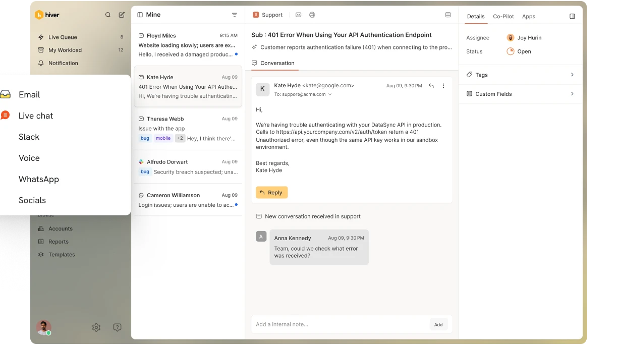
- Multiple interactions are often caused by poor internal routing. Use collaboration features like internal notes and @mentions to loop in the right people quickly.

Internal notes and @mentions in Hiver’s interface
5. Resolution Rate
Resolution Rate measures the percentage of support tickets your customer service team successfully resolves—out of the total tickets received. In other words, it tracks how often you actually solve the customer’s issue, not just respond to it.
Pro Tip: Exclude tickets marked as spam or duplicates to avoid skewing the metric.
It’s one of the clearest indicators of support effectiveness. A high resolution rate suggests your team is closing the loop efficiently.
👉 How to calculate it:
Resolution Rate = (Resolved tickets ÷ Total tickets received) × 100
How to use it:
- Set a team-wide resolution benchmark. Anything under 85–90% warrants a deeper look. Are tickets being closed prematurely? Are unresolved issues slipping through the cracks?
- Tag reasons for unresolved tickets. Whether it’s feature requests, third-party delays, or waiting on customer input—create categories to spot patterns.
- If a resolution depends on a product update or fix, don’t leave customers in limbo. Share an ETA, provide workarounds, or follow up when the feature is live.
6. Average Handle Time
Average Handle Time measures the total time it takes for a support agent to resolve a customer query—from the moment it’s received to when it’s fully resolved, including all back-and-forth interactions and follow-ups.
Originally rooted in call center operations, AHT is now applicable to other chanels—chat, email, and even messaging apps like WhatsApp. For calls, AHT typically includes:
- Talk time: Time spent speaking with the customer
- Hold time: Time spent waiting or being transferred
- After-call work: Internal documentation or follow-ups
For email or chat:
- Time spent reading, writing, and resolving the query
- Internal notes or system updates after closure
👉 How to calculate it:
Average handle time = Total handle time (across all tickets) ÷ Total number of tickets handled
This includes time spent on direct interactions + after-contact activities.
👉 How to use it:
- Track it alongside CSAT and First Contact Resolution. If AHT is low but CSAT is dropping, agents may be rushing at the expense of quality. Conversely, if AHT is high and satisfaction is strong, you might be handling complex issues well—but could still streamline processes.
- AHT will differ across phone, email, and chat. Avoid applying a single benchmark across the board—set realistic benchmarks per channel and issue type.
- Use automation for post-resolution tasks, add an internal knowledge base, FAQs, or streamline ticket routing to shave off unnecessary time.

Internal knowledge base
Recommended reading
7. SLA Adherence
SLA Adherence measures how consistently your customer service team meets the response and resolution times promised in your Service Level Agreements (SLAs). It’s a direct reflection of your team’s reliability and efficiency in handling customer issues.
👉 How to calculate it:
Percentage of tickets that met the agreed-upon service levels = (Number of tickets resolved within SLA / Total number of tickets) × 100
👉 How to use it:
- Monitor performance trends. Regularly track SLA adherence to identify patterns and address potential issues proactively.
- Identify bottlenecks. Analyze tickets that breached SLAs to uncover common causes, such as specific issue types or timeframes.
- Enhance resource allocation. Use insights from SLA adherence metrics to optimize staffing and prioritize high-impact areas.
With Hiver, you can set custom SLAs for different ticket categories, automate alerts for approaching deadlines, and generate detailed reports to keep your team aligned and responsive.

Set custom SLAs using Hiver
8. Backlog
Backlog refers to the number of unresolved customer issues that have exceeded your defined response or resolution window—typically based on internal SLAs (Service Level Agreements).
In other words, these are the tickets that should have been addressed, but haven’t. If left unchecked, a growing backlog can lead to long wait times, missed SLAs, and declining customer satisfaction.
👉How to calculate it:
Define your expected resolution time using SLAs (e.g., 24 or 48 hours) – Count the number of tickets still open after this SLA window
For example, if you commit to 24-hour resolution and have 53 tickets older than that, your backlog is 53.
👉 How to use it:
- A consistent spike—even when new ticket volume is steady—indicates workflow inefficiencies or staffing gaps.
- Break backlog down by channel, agent, issue type, or region. You’ll quickly spot where the slowdown is happening—say, a specific agent overloaded with escalations or a channel (like chat) that lacks coverage.
With Hiver, you can monitor backlogs in real time by tagging overdue tickets, sorting them by priority or agent, and setting up SLA alerts. This ensures urgent issues get immediate attention—before they become part of the pile.
Customer Service Metrics for Experience & Ease
9. Customer Effort Score (CES)
Customer Effort Score (CES) measures how easy it is for a customer to get something done—whether that’s solving a problem, using a feature, or just getting a reply from support.
It’s usually captured with a simple survey question:
“How easy was it to [complete X]?”
Responses are rated on a scale—typically from 1 (Very Difficult) to 7 (Very Easy).
The idea behind Customer Effort Score is straightforward: if you make things easy, customers stick around. Studies show that reducing customer effort is one of the most effective ways to boost loyalty and reduce churn.

Customer Effort Score Questions for customer feedback
👉 How to calculate it:
Just take the average of all CES responses over a defined time period. Higher averages indicate smoother customer experiences.
👉 How to use it:
- If CES is low after specific actions—like raising a ticket or updating billing details—it’s a sign those processes need work.
- Use CES after customer onboarding, self-service, or checkout flows to find hidden frustrations that CSAT might miss.
- Pair CES with open-text customer feedback to understand why an experience felt difficult. That’s where the real insights come from.
10. Preferred Communication Channel
Preferred communication channel shows where your customers want to interact with your support team—whether it’s email, phone, live chat, WhatsApp, or social media. Being available on their chosen channel improves satisfaction and helps resolve issues faster.
According to Hiver’s “State of Customer Support” report, 77% of customers prefer contacting brands via email, with live chat as a close second (63%), followed by phone calls (63%).

Top support channels preferred by customers
👉 How to track it:
There’s no fixed formula, but most customer service platforms (like Hiver) automatically track where each ticket comes from—email, chat, WhatsApp, phone, etc.
You can access channel-wise breakdowns of ticket volume, resolution times, and agent performance—making it easy to adjust staffing and workflows based on real usage patterns.
👉 How to use it:
- Double down on high-volume channels. If 70% of queries come through email, but only 2 agents handle it, you’ve got a problem. Align staffing with actual demand to avoid delays.
- Optimize low-volume but important channels. Even if only 5% of customers use WhatsApp, those messages could be high-priority. Use alerts, SLA triggers, or auto-routing to prevent missed responses.
11. Customer Sentiment
Customer Sentiment measures how customers feel about your brand, products, or service. It captures emotions like satisfaction or frustration through feedback, reviews, and interactions.
Instead of focusing on numbers, it highlights the emotional side of the customer experience, offering deeper insight into your customer service performance and how your brand is perceived.
👉 How to measure it:
While there’s no single formula, Customer Sentiment is typically assessed through:
- Surveys and feedback forms: Collecting direct responses to understand customer feelings.
- Text analysis tools: Utilizing natural language processing to interpret emotions in written feedback. For instance, using tools such as Mention, and its sentiment analysis feature lets you categorize and display different sentiments, offering insights into customer emotions across different channels.

Sentiment analysis tool
- Social media monitoring: Analyzing mentions and comments to gauge public perception.
👉 How to use it:
- Identify emotional triggers. Understand what aspects of your service elicit strong emotional responses, and address areas causing negative sentiments.
- Regularly track sentiment to stay ahead of potential PR issues and maintain a positive brand image.
12. Self-Service Usage
Self-service usage tracks how often customers turn to self-help resources like knowledge bases, FAQs, or chatbots instead of contacting support. It shows how effective your customer self-service tools are at resolving common issues and reducing ticket volume. The easier it is for customers to help themselves, the faster the resolution and the higher the satisfaction.
👉 How to calculate self-service usage:
There’s no single formula, but two data points matter most:
- Page views on your help center or FAQ articles
- Contact rate after self-service (i.e., how many users still reached out for help after viewing a self-service resource)
A simple proxy metric: Self-Service Usage Rate = (# users who viewed self-help content without contacting support ÷ Total users who viewed self-help content) × 100
👉 How to use it:
- Review your customer service data on most-viewed and highest drop-off articles. Are they answering the right questions? Are they written clearly and optimized for search?
- Surface your knowledge base where customers actually look—like your website, support widget, or inside product workflows.
- Use ticket tags or chatbot analytics to spot FAQs you haven’t yet covered. Turn those into self-service content.
- Add quick “Was this helpful?” prompts on articles and track responses to identify where users get stuck.
Customer Service Metrics for Satisfaction & Loyalty
13. Customer Satisfaction Score (CSAT)
Customer Satisfaction Score (CSAT) measures how satisfied customers are with a specific interaction or overall service experience. It’s typically collected through quick surveys that ask customers to rate their experience on a scale (e.g., 1–5 or 1–10).
CSAT is especially useful for capturing feedback right after key moments—like resolving an issue or completing a conversation with support. To get the complete picture, here’s what to include:
- Quick, one-question surveys sent immediately after an interaction—ideal for capturing in-the-moment feedback.
- Longer surveys (sent quarterly or biannually) that include open- and close-ended questions. These are great for uncovering deeper insights about the overall experience.
👉 How to calculate it:
CSAT = (Number of positive responses / Total responses) × 100
For example, if 80 out of 100 customers rate their experience as 4 or 5 stars, your CSAT score is 80%.
👉 How to use it:
- Send CSAT surveys immediately after significant interactions, like resolving a support ticket, to capture real-time feedback.
- Implement follow-up questions to understand the reasons behind dissatisfaction. For example, ask, “What could we have done to improve your experience?”
- Regularly review CSAT scores to identify patterns and make informed decisions for service enhancements.
If you’re using Hiver, you can seamlessly integrate CSAT surveys at the end of every customer interaction. This allows you to gather immediate, accurate feedback without disrupting the customer experience.

Automate CSAT surveys
14. Net Promoter Score (NPS)
Net Promoter Score (NPS) measures how likely customers are to recommend your product or service to others. It’s a key indicator of overall customer loyalty and brand perception, used to gauge customer satisfaction beyond one-off support interactions.
NPS is typically collected through a single question:
“On a scale of 0 to 10, how likely are you to recommend us to a friend or colleague?”
Based on responses, customers are grouped into:
- Promoters (9–10): Loyal enthusiasts, likely to refer others
- Passives (7–8): Satisfied but may not refer others
- Detractors (0–6): Unhappy customers who may switch to a competitor or speak negatively of your brand

Net promoter score scale
👉 How to calculate it:
NPS = % of Promoters – % of Detractors = NPS
For example, if 60% are Promoters and 20% are Detractors, your NPS is 40.
👉 How to use it:
- Pair the score with a follow-up question like “What’s the main reason for your score?” This gives you open-ended feedback into what customers love—or what’s driving them away.
- If your NPS is trending down, compare it alongside CSAT, resolution time, or contact rate. A dip often points to product friction or service breakdowns.
- NPS isn’t a one-time stat. Measure it quarterly or biannually to understand how loyalty shifts as you roll out new features or improve support.
15. Customer Retention Rate
Customer Retention Rate measures how well your business keeps existing customers over a given period. It’s a key indicator of long-term customer satisfaction, loyalty, and the strength of your post-sale experience.
👉 How to calculate it:
Retention rate: [(Customers at end of period – New customers) / Customers at start of period] × 100
This gives you the percentage of customers you’ve successfully retained—excluding any new signups.
👉 How to use it:
- Map retention to the customer journey. If users drop off early, fix onboarding. If they leave after a few months, check if value delivery or support didn’t meet expectations.
- Occasional users require re-engagement. Use timely nudges like feature updates or progress summaries to draw them back in. If they churn, follow up to understand why.
Recommended reading
Customer Service Metrics That Flag Risks
16. Escalation Rate
Escalation Rate tracks the percentage of support conversations that your frontline team can’t resolve—and need to be passed on to senior agents or specialists. It’s a strong signal of how confident and capable your primary support layer is.
Some escalations are expected, such as technical issues or sensitive customer concerns. But if they’re happening too often, it’s a sign that something needs attention.
👉 How to calculate it:
Escalation rate = (Escalated tickets / Total tickets) × 100
👉 How to use it:
- If basic queries are getting escalated, your agents may lack the product knowledge or tools to handle them. That’s a coaching opportunity.
- An overwhelmed team may escalate more than necessary. If that’s the case, look into team capacity—not just skill.
17. Reopened Tickets
Reopened tickets measure the percentage of support cases that customers reopen after they’ve been marked as resolved. It’s a direct indicator of how effectively your team resolves issues the first time—and how confident customers feel about the solutions they receive
👉 How to calculate it:
Reopened Ticket rate = (Number of reopened tickets / Total tickets resolved) × 100
👉 How to use it:
- Audit resolution quality. Review reopened tickets to identify if agents are closing cases too early or providing incomplete solutions.
- Identify recurring issues. Look for patterns in reopened tickets to spot common problems that may need broader fixes.
- Enhance training programs. Use insights from reopened tickets to inform agent training, focusing on areas where resolutions often fall short.
18. Customer Churn Rate
Customer churn rate refers to the percentage of customers who stop using your product or service over a specific period. While some churn is inevitable, a rising rate often signals deeper problems—such as poor onboarding, unclear value delivery, or inconsistent support.
Acquiring a new customer is significantly more expensive than retaining one, which makes churn a critical metric for any customer-centric business aiming for sustainable growth.
👉 How to calculate it:
Churn rate = (Customers lost during period / Total customers at start of period) × 100
For example, if you started the quarter with 500 customers and lost 25 by the end, your churn rate would be 5%.
The time frame for measuring churn varies by industry. SaaS businesses might track it monthly; services like consulting or real estate may review it quarterly or even annually.
👉 How to use it:
- If there’s a spike in customer churn, cross-check support metrics like CSAT, CES, or resolution time during the same period. You might uncover issues brewing beneath the surface.
- Dig into exit signals. Were these customers inactive for weeks before leaving? Did they stop opening your emails? These behavioral cues often precede churn.
- Talk to churned customers. Customer surveys are helpful, but a quick exit interview can surface issues you didn’t know existed—like friction in onboarding or lack of clarity in billing.
Tracking the Right Customer Service Metrics
Let’s face it—you can’t improve what you don’t measure. Tracking the right customer service metrics gives you clarity on how your team is performing, where the gaps are, and how you stack up against industry benchmarks.
But metrics alone won’t move the needle. The real impact comes when you turn those numbers into action. Prioritize what matters, fix what’s broken, and double down on what’s working—and you’ll start to see a real shift in your customer experience.
Because in the end, it’s not about tracking for the sake of it. It’s about using that insight to create support that’s faster, easier, and more human.
Frequently Asked Questions
1. What are customer service metrics?
Customer service metrics are key performance indicators (KPIs) that measure the effectiveness, efficiency, and quality of customer support. These metrics help businesses track customer satisfaction, response times, resolution rates, and overall service performance.
2. Why are metrics important in customer service?
Customer service metrics provide data-backed insights into support team performance, customer satisfaction, and areas for improvement. By analyzing these metrics, businesses can enhance customer experiences, improve response times, and optimize support operations. For example, tracking First Response Time can indicate how quickly customers receive an initial reply on their ticket, while monitoring Average Resolution Time can highlight how long it takes to fully resolve an issue.
3. What are the 4 key metrics of customer satisfaction?
The four key customer satisfaction metrics are:
- Customer Satisfaction Score (CSAT) – Measures how satisfied or dissatisfied customers are with a specific interaction, product, or service, typically through a post-interaction survey.
- Net Promoter Score (NPS) – Evaluates customer loyalty by asking how likely they are to recommend your business to others on a scale of 0-10.
- Customer Effort Score (CES) – Assesses how much effort a customer has to put in to use a product or service, or get in touch with your team. Lower effort generally indicates higher satisfaction.
- Customer Experience Rating (CER) – Measures how customers perceive their interaction with your brand, considering factors like ease of use, and efficiency, typically via long and short surveys.
4. What are the 5 key performance indicators of customer service?
The five essential KPIs for customer service are:
- First Response Time (FRT) – Measures how quickly customers receive the first response to their ticket or query.
- Resolution Time – Tracks the average time it takes for your support team to fully resolve a customer issue from the moment it is reported.
- Customer Satisfaction Score (CSAT) – Measures customer satisfaction based on their experience with a product, service, or support interaction. It is typically collected through post-interaction surveys using a rating scale (e.g., 1-5 or 1-10).
- Net Promoter Score (NPS) – Assesses customer loyalty by asking how likely they are to recommend your brand on a scale from 0 to 10. Respondents are categorized as Detractors (0-6), Passives (7-8), or Promoters (9-10).
- Customer Retention Rate – Measures the percentage of customers a business retains over a given period. A high retention rate indicates that your customer support team is doing well, and there’s strong customer loyalty and satisfaction.
5. What are some examples of customer service performance metrics?
Some key examples of top customer service metrics include:
Churn Metrics – Analyzes customer retention rates and identifies why customers leave, helping businesses fix internal processes and strategies.
Customer Satisfaction Score (CSAT) – Measures how satisfied customers are with a service interaction, typically on a scale from 1-5 or 1-10.
Customer Effort Score (CES) – Assesses how easy it is for customers to use your product or service, with lower effort indicating a better experience.
Net Promoter Score (NPS) – Evaluates loyalty by measuring how likely customers are to recommend your business to others.
Social Media Metrics – Tracks customer engagement, sentiment, and response times on platforms like Twitter and Facebook.
Start using Hiver today
- Collaborate with ease
- Manage high email volume
- Leverage AI for stellar service