Skip to content


A customer service dashboard is a real-time visual tool that consolidates all your support data – from ticket volumes and response times to CSAT scores and SLA compliance – into one clear view. Instead of relying on scattered reports and spreadsheets, managers get instant insights into team performance, customer satisfaction, and emerging trends, all in one place.
Support managers often struggle with slow decision-making when they have to pull data from multiple sources. A customer service dashboard solves this by tracking key metrics, highlighting problem areas, and helping leaders act faster.
In this guide, we’ll explain what a customer service dashboard is, why it matters, the most important metrics to track, different types of dashboards you can use, and best practices to integrate them into your workflow.
Table of Contents
- What is a customer service dashboard?
- Importance of customer service dashboards
- Key metrics to track in a customer service dashboard
- Types of customer service dashboards
- Step-by-step guide to building a customer service dashboard
- 5 best practices for using dashboards effectively
- Wrapping up
- FAQs
What is a customer service dashboard?
A customer service dashboard is a real-time, centralized view of how your support team is performing. It gathers data from your helpdesk and connected tools to show the most important metrics such as ticket volume, customer interactions, response times, SLA compliance, and customer satisfaction — all in one place.
Most dashboards cover three main areas:
- Workload: new tickets, backlog, and ticket volume by channel
- Efficiency: first response time, resolution time, SLA status
- Quality: CSAT, NPS, CES, and recent customer feedback
Managers use dashboards to prioritize urgent tickets, balance workloads, and plan staffing. Agents benefit too, since they can track active conversations, deadlines, and customer sentiment in real time.
Example: An airline support team might use a dashboard to track spikes in ticket volume during holiday seasons. They can quickly reassign agents or add temporary staff to handle the surge by monitoring real-time SLA breaches and CSAT dips.
Importance of customer service dashboards
Dashboards give support teams visibility into live performance data. Managers use them to guide staffing and service quality, while agents rely on them to stay on top of their workload. The table below highlights how dashboards support each group in different ways:
How dashboards help managers:
- Monitor SLA compliance, first response rate, and resolution trends: Dashboards show whether conversations are on track to meet service-level agreements. For example, if first response times consistently slip on Monday mornings, managers can add more coverage during that period.
- Track CSAT and NPS to measure customer sentiment: Survey results can be tracked alongside ticket trends. If CSAT dips after a product update, managers can trace which ticket categories received the most negative feedback and adjust processes accordingly.
- Balance workload across agents and channels: Workload dashboards reveal how many conversations each agent is handling and where backlogs are building. For instance, if live chat spikes during a sale, managers can reassign agents from email to chat in real time to prevent bottlenecks.
Recommended reading
- Detect bottlenecks early and adjust staffing: Dashboards make it easy to spot recurring delays, such as long resolution times on certain issue types. If technical queries take twice as long as billing questions, managers can provide targeted training or bring in specialists.
How dashboards help agents:
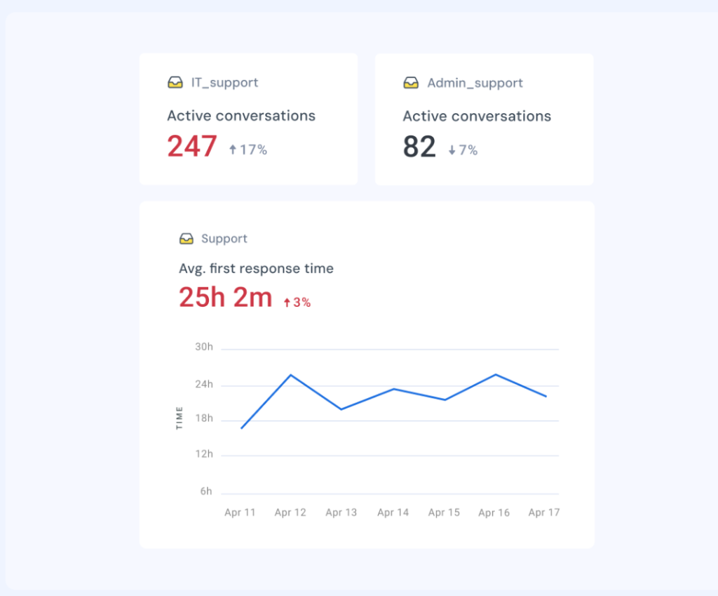
- View all active conversations and deadlines in one place: Instead of toggling across inboxes, agents can see emails, chats, and pending follow-ups on a single screen. For example, an agent might have:
- 8 email tickets waiting for replies
- 3 live chats in progress
- 2 WhatsApp queries due within the next 30 minutes
- 1 SLA breach risk flagged for the end of the hour
Having this view helps agents prioritize tackling urgent SLA-bound tickets effectively while keeping an eye on ongoing live chats.
- Get alerts on pending SLAs or overdue follow-ups: Alerts ensure agents don’t miss time-sensitive commitments. A simple notification about an SLA nearing breach allows them to respond before it escalates. For example, if a ticket is 50 minutes into a 1-hour SLA window, the system can flag it so the agent replies immediately. A simple notification like this prevents escalations and helps maintain response targets.
- Gauge customer sentiment before replying: Some dashboards integrate sentiment analysis from emails or chat. If a message is flagged as negative, the agent can approach the conversation with more empathy and prepare a structured response.
- Stay focused on the most urgent tasks: By surfacing deadlines and priority tickets at the top, dashboards reduce the mental load of deciding what to do next. Agents spend less time figuring out which tickets to pick and more time resolving them.
Recommended reading
Customer Service Ticket 101: Understanding Types, Priority Levels, Categories and more
Key metrics to track in a customer service dashboard
How useful a customer service dashboard is depends on the key metrics it tracks. With the right data, managers can monitor performance in real time, and agents know exactly what to prioritize. Here are the essential numbers every dashboard should include:
1. First response time (FRT)
FRT measures how quickly your team replies to a customer’s initial message. Faster responses improve satisfaction and prevent escalations.
Formula:

Example: If 500 tickets received a total of 2,000 minutes in first responses, your FRT would be 4 minutes.
2. Average resolution time (ART)
ART shows how long it typically takes to fully close an issue. Monitoring this highlights where processes slow down and whether additional training or automation is needed.
Formula:

Example: If 200 tickets take 400 hours to resolve, the ART is 2 hours per ticket.
3. First contact resolution (FCR)
FCR tracks the percentage of issues solved in a single interaction. A higher FCR means agents are equipped with the right information and tools.
Formula:
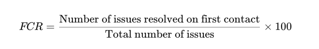
Example: If 800 out of 1,000 tickets are resolved in the first interaction, FCR = 80%.
4. Customer effort score (CES)
CES reflects how much effort a customer must put in to get an issue resolved, usually through a post-interaction survey. Lower CES signals smoother workflows, while higher effort scores highlight friction points that frustrate customers.
Formula:

Example: If the total of all effort ratings is 350 and there are 50 responses, the CES = 7.
5. Customer satisfaction (CSAT)
CSAT measures how happy customers are with a specific interaction, usually through a quick survey sent after the issue is resolved. Tracking CSAT trends shows whether the team is consistently meeting customer expectations and highlights areas where service is falling short.
Formula:

Example: If 80 out of 100 customers rate their experience positively, CSAT = 80%.
6. Net Promoter Score (NPS)
NPS reveals customer loyalty and likelihood to recommend your business. Tracking Net Promoter Score over time shows service impacts long-term relationships.
Formula:

Example: If 70% are promoters and 10% are detractors, your NPS = 60.
7. Agent productivity
Agent productivity highlights how many conversations each agent is handling, how quickly they resolve them, and if they’re meeting SLAs.
Formula:

Example: If 5 agents resolve 500 conversations in a week, average productivity = 100 tickets per agent.
8. Workload distribution
Workload distribution shows how evenly tickets are spread across the team. This helps prevent burnout and ensures customers aren’t left waiting.
Formula:

Example: If 1,000 open tickets are spread across 20 agents, each handles an average of 50.
9. Quality assurance scores
Quality assurance scores indicate how well agents follow service standards and communication guidelines. Tracking these scores helps maintain consistency across the team and identify training needs.
Formula:

Example: If an agent scores 85 out of 100 in QA reviews, their QA score = 85%.
When put together, these key metrics give a complete view of speed, quality, and workload. They help managers spot risks before they escalate and give agents clarity on what to prioritize. The right dashboard makes these numbers easy to monitor in real time, turning raw data into daily decisions that improve customer service.
Recommended reading
18 Customer Service Metrics That Actually Improve Support (Not Just Track It)
Types of customer service dashboards
Different dashboards serve different purposes, depending on whether the focus is on team productivity, customer sentiment, operations, or self-service. Most organizations use a mix of these to get a balanced view of performance. The four main types are outlined below.

1. Agent performance dashboards
Agent performance dashboards focus on efficiency at the individual or team level. They typically track metrics such as first response time, average resolution time, SLA compliance, and queue health. These dashboards give managers a clear view of how agents are performing against targets and help identify when workloads need to be redistributed. For agents, they provide clarity on active conversations, upcoming deadlines, and where to prioritize effort.
For example: A manager might notice that one agent is handling nearly 40% of all urgent tickets. By spotting this imbalance, they can quickly redistribute workloads to prevent burnout and maintain consistent response times across the team.
2. Customer experience dashboards
These dashboards provide insight into how customers feel about the support they receive. They usually include feedback-based metrics such as CSAT, NPS, and CES, along with sentiment analysis from ongoing conversations. This type of dashboard helps leaders understand whether customers are satisfied, loyal, or at risk of churn, and it highlights areas where service improvements are required.
For instance: A CX dashboard might highlight a week-on-week dip in CSAT scores on WhatsApp. Leaders can use this insight to reroute conversations to more experienced agents until overall service quality improves.
3. Operational dashboards
Operational dashboards give managers visibility into the overall flow of support operations. They bring together metrics like ticket volume by channel, backlog levels, staffing needs, and peak activity times. By using these dashboards, managers can plan agent schedules more effectively, forecast demand, and make sure service levels are consistently met.
For example: An operational dashboard could reveal that ticket spikes consistently occur every Monday at 9 AM. With this information, managers can adjust shift schedules so that more agents are available earlier in the day to handle the increased volume.
4. Self-service dashboards
Self-service dashboards measure how effective self-service options are in reducing ticket volume. They track knowledge base usage, chatbot containment rates, and overall deflection percentages. These dashboards show how often customers resolve issues on their own, and they highlight opportunities to improve self-service resources such as FAQs, help articles, or bot scripts.
For instance: A self-service dashboard might show that 65% of password reset queries are being resolved through the knowledge base. This indicates that the self-service content is effective, while also pointing to opportunities to expand coverage for other recurring issues.
These dashboards cover the three dimensions that matter most in customer service: team performance, customer perception, and operational efficiency. Along with these standard views, teams often need dashboards tailored to their own role. With Hiver, you can create custom dashboards by choosing the metric, inbox, and visualization that matter most.
- Add widgets: Pick the metrics you want to display (e.g., new conversations, resolved conversations, emails sent, CSAT).
- Select inboxes: Choose one or more inboxes to include so you can monitor multiple teams together.
- Apply grouping: Organize data by assignee, tags, conversation type, or date to uncover patterns.
- Add filters: Narrow the view further by assignee, status, tags, or conversation type.
Agents may set up a view showing their open conversations and SLA timers, while managers might track backlog and customer sentiment. Senior leaders can schedule reports to receive regular updates by email, making it easier to review performance at a glance.
This flexibility also supports planning. By seeing when workloads peak and how conversations are distributed across channels, managers can schedule shifts more effectively and control costs without affecting service levels.

Step-by-step guide to building a customer service dashboard
A customer service dashboard is only effective if it’s built with clear goals, the right data, and a layout that teams can use daily. Below is a detailed process to help you create dashboards that are accurate, relevant, and easy to act on.
Step 1: Define the purpose
Start by identifying what you want the dashboard to achieve. A single dashboard can’t cover everything; choose whether the focus is on agent productivity, SLA compliance, customer experience, or self-service. For example, a performance dashboard might track response times and SLA breaches, while a self-service dashboard would track knowledge base usage and deflection rates.
Step 2: Select the right metrics
Choose metrics that directly support the goal. Some standard sets include:
- Agent performance: first response time, average resolution time, SLA compliance, and active conversations.
- Customer experience: CSAT, NPS, CES, customer sentiment.
- Operational health: ticket volume by channel, backlog, staffing levels.
- Self-service: knowledge base article views, chatbot containment, deflection percentage.
Aim for 6–8 meaningful metrics. More than that, it can clutter the view and make it harder to interpret trends.
Step 3: Connect data sources
Connect your helpdesk, CRM, live chat, phone, and self-service tools such as a knowledge base, so your dashboard is complete with accurate information. Hiver lets admins add data from multiple inboxes into one view, giving a consolidated picture of workload and performance.
Step 4: Create and configure the dashboard
Dashboards should be set up differently depending on who will use them. Agents may need a view that shows their open conversations and approaching deadlines, while managers may focus on SLA breaches or workload balance. Senior leaders often prefer scheduled reports that give them regular updates on team performance without having to log in.
This setup also makes it easier to plan staffing. By seeing when conversation volume is highest and how work is distributed, managers can schedule shifts more effectively and control costs while keeping service levels steady.
Step 5: Plan the layout of your dashboard
Arrange widgets so the most important metrics are easy to see at a glance. Group-related metrics, for instance, put SLA compliance, first response, and resolution times in one section; customer satisfaction (CSAT) and NPS in another.
Step 6: Automate updates and drill down when needed
Dashboards must reflect real-time performance. Configure them to auto-refresh so the data is always current. Where possible, enable drill-downs so managers can click into widgets to see which inbox, agent, or channel is driving changes. This ensures they can move from high-level views to specific details quickly. With Hiver, teams can build custom dashboards with drill-down capability, role-based filters, and real-time updates, making it easier to go from trends to details without switching tools.
Step 7: Pilot and refine
Before rolling out a dashboard to the entire team, test it with a smaller group. Check if the layout is intuitive, if the metrics are actionable, and whether the information helps them in their daily work. Adjust based on feedback.
Step 8: Share and train
Make dashboards accessible to the right people. Managers may need broad, cross-inbox views, while agents need focused personal or team-level dashboards. Provide short training so everyone understands what each widget means and how to use the information to make data-driven decisions.
Step 9: Review and update regularly
Dashboards shouldn’t remain static. Revisit them during reviews to check if the metrics are still aligned with goals. Add new metrics when workflows evolve, for instance, when launching a new channel like WhatsApp, and remove those that no longer influence decision-making.

“I do a monthly report of my analytics to the entire company, and now we’re averaging 99% response rates within two days. That’s a great metric for us because it shows how we’re staying accountable to our customers.”
Director of Customer Communication
5 best practices for using dashboards effectively
A customer service dashboard only delivers value if it’s designed and used with purpose. Too often, teams end up with cluttered dashboards full of numbers but little insight, or they stop checking them because the data feels outdated. That’s why following a few proven best practices for customer service dashboards is so important. Here are five best practices to guide you.
1. Prioritize actionable metrics: Only include metrics that inform day-to-day decisions, such as SLA compliance, customer satisfaction (CSAT) trends, unresolved tickets, or agent workload distribution. Exclude long-term or vanity numbers that do not drive immediate action.
Recommended reading
17 Best Help Desk Metrics and KPIs to Measure and Track in 2025
2. Create role-specific dashboards: Agents should only see metrics that help them act now — like their queue, SLA timers, and pending follow-ups. Managers need broader dashboards with backlog, workload balance, and customer sentiment. Executives should get a high-level summary. Configure and assign dashboards accordingly.
3. Tie every metric to a clear response: A dashboard is most useful when each metric has a clear next step. For example, SLA breaches should trigger ticket reassignment, low customer satisfaction (CSAT) should prompt a review of recent conversations, and sudden spikes in ticket volume should lead to immediate adjustments in staffing. Defining these responses in advance ensures dashboards guide action rather than simply display numbers.
4. Ensure real-time data updates: Dashboards should always reflect the latest information. Set them to refresh automatically and enable alerts for unusual activity. For instance, if the backlog exceeds a defined threshold, managers should be notified right away instead of discovering the issue in a later report.
5. Use dashboards in team discussions: Bring dashboards into daily and weekly routines so decisions are data-driven. In stand-ups, review open tickets and SLA risks together with your team. In weekly reviews, use customer satisfaction (CSAT) and NPS trends to identify areas for training or process changes. Making dashboards part of these conversations keeps performance visible to everyone.
6. Review and act consistently: Dashboards can become cluttered if left unchecked. Conduct a quarterly audit to remove metrics that aren’t being used in meetings or check-ins, and add new ones when workflows or channels change. Keeping dashboards lean ensures that every widget serves a purpose.
Recommended reading
Wrapping up
A customer service dashboard brings clarity to the constant flow of support activity. Instead of digging through multiple reports or waiting for weekly summaries, teams get a live view of what’s happening – from rising ticket volumes to shifts in customer sentiment. This visibility helps managers step in before small issues grow, ensures workloads are balanced across the team, and keeps service quality steady.
When dashboards are thoughtfully designed and tied to the right metrics, they become more than numbers on a screen – they turn into a decision-making compass for the entire support function. Whether you’re tracking SLAs, monitoring agent performance, or spotting trends in customer feedback, a dashboard helps your team move from reactive firefighting to proactive support.
If you’re exploring tools, platforms like Hiver make it easier to create custom dashboards that highlight bottlenecks, track performance, and surface AI-powered insights. Take a free trial.
FAQs
What is the purpose of a customer service dashboard?
It gives managers and agents real-time visibility into performance metrics like SLA compliance, ticket volume, and customer satisfaction, helping them make faster, data-backed decisions.
What should a customer service dashboard include?
Key metrics such as first response time, resolution time, SLA status, customer satisfaction, NPS, CES, and workload distribution across agents and channels.
How often should dashboards be updated?
Dashboards should refresh in real time or at short intervals. Outdated data reduces trust and leads to poor decision-making.
Can dashboards be customized for different roles?
Yes. Agents benefit from dashboards showing personal queues and SLA deadlines, while managers and executives need broader views of team-wide performance and customer satisfaction.