Skip to content


I’m sure you don’t need me to tell you that relying on guesswork to understand your customers just won’t cut it.
To keep customers engaged in this competitive market space, you need to fully leverage data — and that’s where customer analytics software comes in.
It tracks every interaction, purchase, and click and translates it into valuable insights that can help you fine-tune how you market your brand, make a sales pitch, and offer support to customers.
In simplest words, these tools convert raw data into actionable insights.
The best part is that these tools present customer insights in a manner that is easy to understand—dashboards, heatmaps, bar graphs, etc.
In this guide, I’ll explain the scope of customer analytics software and its benefits. I’ll also list 12 of the best tools that can help identify customer pain points and make targeted improvements to your business.
[cta_block]
Table of Contents
- What is a customer analytics software?
- What are the main KPIs to track?
- How can your business benefit from customer analytics tools?
- 12 Best customer analytics software tools in 2025
- Things to keep in mind while selecting a customer analytics software tool
- Ready to leverage customer insights to improve decision-making?
What is a customer analytics software?
A customer analytics software is a specialized tool that enables businesses to collect, analyze, and interpret customer behavior and interaction data. This software helps organizations gain insights into customer preferences, trends, and behaviors, allowing them to make informed decisions that enhance customer experiences and drive business growth.
For example, a company can use customer analytics to identify key trends such as ‘X% of customers didn’t return to the website after their first purchase’. The data might reveal that these customers often mention slow delivery as a pain point in their feedback. With this insight, the company can focus on improving delivery speed.
That’s just one way of using a customer analytics tool. Let’s take a look at other critical functions of a customer analytics tool:
- Data collection and integration: The software gathers data from various sources, including third-party websites, social media, customer service interactions, and sales transactions. It is equipped to collect quantitative data (e.g., transaction amounts and website visits) and qualitative data (e.g., customer feedback reviews).
- Behavior analysis: It analyzes customer interactions to identify patterns and trends. For example, it can reveal which products are frequently purchased together or which pages customers frequent the most on your website.
- Segmentation: Businesses can segment their customer base into distinct groups based on shared characteristics, such as demographics or purchasing behavior. This segmentation allows for targeted marketing strategies.
- Predictive analytics: Many customer analytics tools employ predictive modeling to forecast future customer behavior. For instance, they can predict which customers are likely to churn. Such insights help you proactively engage with these customers and see what can be done to improve their experience.
- Data visualization: The insights are presented in a visually engaging format, such as dashboards and graphs. This makes it easier for stakeholders to interpret data and make decisions quickly.
Recommended Reading: 11 Excellent Customer Engagement Strategies
What are the main KPIs to track?
Customer analytics software is only as effective as the KPIs it helps you measure. That’s why knowing what metrics you want to track is important. Here are some of the most essential ones you need to be keeping tabs on:
Customer Satisfaction (CSAT)
- Measures how satisfied customers are with your products, services, or interactions
- Use surveys after a specific interaction – let’s say with your support team – to track this metric.
- Provides clear insights into what your customers like and dislike about specific interactions.
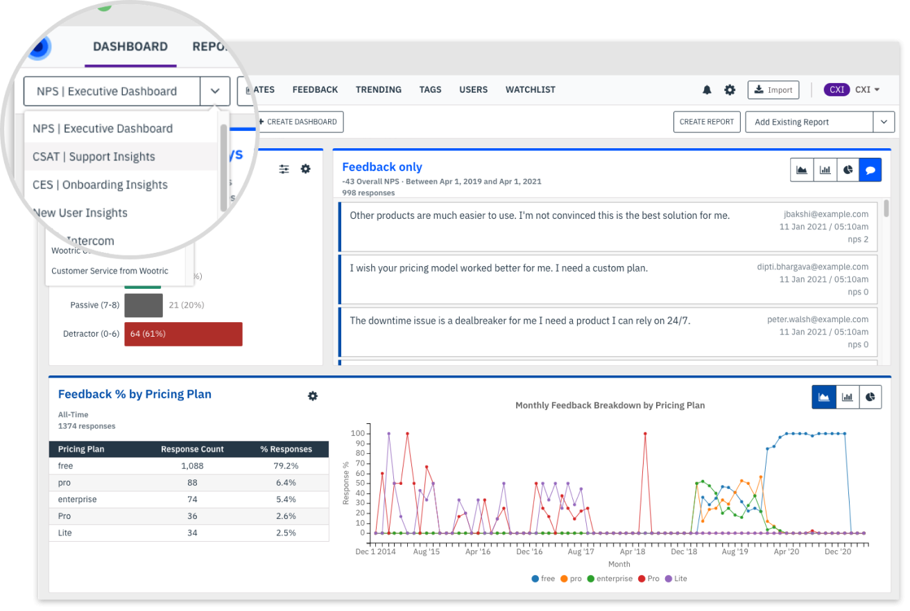
Net Promoter Score (NPS)
- Measures customer loyalty by asking customers how likely they are to recommend your company to friends and family.
- An overall indicator of customer satisfaction and brand perception.
- It helps identify promoters (customers who rate you 9 and 10), passives (customers who rate you 5 to 8), and detractors (those who rate you below 5) to focus retention efforts.
Customer Effort Score (CES)
- Measures how much effort a customer has to put forth to get an issue resolved or request fulfilled
- Indicates how easy it is to do business with your company
- It helps identify friction points in the customer journey
Customer Lifetime Value (CLV or CLTV)
- Estimates the total revenue a customer will generate over the lifetime of their relationship with your business
- Helps prioritize high-value customers and identify opportunities for growth
- Provides insights into the effectiveness of customer retention strategies
Churn Rate
- Measures the percentage of customers who have stopped doing business with your company over a given period
- Indicates the effectiveness of your customer retention efforts
- Helps identify at-risk customers
Customer Acquisition Cost (CAC)
- Measures the average cost to acquire a new customer
- Provides insights into the efficiency of your marketing and sales efforts
- Helps determine the profitability of acquiring new customers
Conversion Rate
- Measures the percentage of customers who complete a desired action, such as making a purchase
- Indicates the effectiveness of your marketing and sales strategies
- Helps identify areas for optimization to improve conversion rates
Customer Engagement
- Measures the level of interaction and involvement customers have with your brand
- Includes metrics like website visits, social media interactions, and email open rates
- Helps identify opportunities to increase engagement and build stronger customer relationships.
Customer Retention Rate
- Measures the percentage of customers who continue to do business with your company over time
- Indicates the effectiveness of your customer retention strategies
- Helps identify areas for improvement to keep customers loyal and engaged.
How can your business benefit from customer analytics tools?
Customer analytics software tools can benefit your business by providing valuable insights into customer behavior, preferences, and interactions. Let me show you how your business can benefit from these tools with actual use cases.
1. Understand your customers better:
The most important benefit of a customer analytics tool is that it helps you uncover customer needs and expectations. What do your customers like? What do they expect when they visit your website?
For example, you’ve launched a new eco-friendly line of products. You can use a customer analytics tool that your customers prefer. If your analytics tool shows that many customers prefer this new line of eco-friendly products, you can tailor your marketing campaigns to highlight your green initiatives, improving engagement and sales.
2. Effective customer segmentation
Customer analytics allows you to segment their customer base into distinct groups or ‘cohorts’ based on shared characteristics or behaviors. Analyzing customer cohorts helps tailor marketing strategies to specific audiences.
Example: A cosmetics brand uses customer analytics to identify segments, such as young adults interested in skincare and older customers focused on anti-aging products. The brand can increase engagement and conversion rates by creating targeted marketing campaigns for these groups.
3. Predict future trends
With predictive analytics, you can forecast future customer behaviors based on historical data. This helps you anticipate customer needs and remain one step ahead of the competition.
Example: An online streaming service analyzes viewing habits to predict which genres will be popular in the coming months. By investing in content that aligns with these predictions, they can attract more subscribers and retain existing ones.
4. Identify at-risk customers
Customer analytics can help businesses identify customers who are likely to churn. By recognizing warning signs, companies can proactively retain these customers.
Example: A subscription service analyzes usage patterns and notices that specific customers have significantly reduced product usage. By reaching out with targeted offers or personalized content, the service can encourage these customers to encourage these customers to use the product more frequently.
5. Resource allocation
With insights from customer data, businesses can allocate resources more effectively. Understanding which products or services are most popular allows for better inventory management and marketing budget allocation.
Example: A restaurant chain uses analytics to determine which menu items are most popular in different locations. The chain can maximize sales and minimize waste by ensuring the raw ingredients for these items are adequately stocked and that their cooks across branches are all well-trained to make them.
12 Best customer analytics software tools in 2025
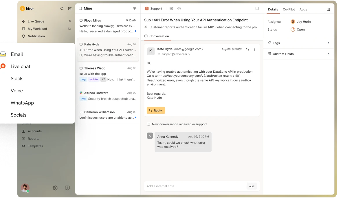
1. Hiver
Hiver is a customer service platform that works inside your Gmail or Outlook inbox. It basically transforms your inbox into a helpdesk and helps teams manage multiple support channels—email, chat, phone, and WhatsApp—from one central place. With hIver, you can also automate workflows, collaborate on customer queries, and track key support metrics.
Hiver differs from other help desks because it works inside your Gmail/Outlook inbox. That makes it incredibly easy to set up and use. Teams also don’t have to toggle between multiple apps – inbox, analytics platform, and project management tools.
Key analytics and reporting features in Hiver:
- Customer insights and reporting: Hiver equips teams with detailed insights into customer interactions and team performance. Track key metrics such as first response time, average resolution time, and customer satisfaction score.
- Customer interaction tracking: Hiver allows you to monitor how customers interact with your support team. You can track the volume of tickets, the types of issues raised, and the outcomes of those interactions. This helps understand common customer issues and overall engagement levels.
- Identifying trends and insights: Hiver helps businesses uncover customer behavior and preferences trends. For instance, tag reports can reveal the most common inquiries, allowing teams to allocate resources effectively and improve service delivery for frequently asked questions or issues.
- Trend analysis: Hiver helps businesses spot trends in customer behavior and support requests. This includes identifying peak times for support requests or recurring issues that need addressing.
User Reviews
- One user noted, “The overall experience is great as now we can have great analytics of each issue on a user basis, which helps us for feedback in the future.” (source)
- Users find value in Hiver’s ability to identify bottlenecks in the email management process. This helps teams understand traffic patterns and optimize their workflows accordingly. (source)
Pricing
Hiver offers several pricing plans to suit different business needs:
- Lite Plan: $19/user/month when billed annually
- Pro Plan: $49/user/month when billed annually
- Elite Plan: $79/user/month when billed annually
All plans include a 7-day free trial with no credit card required. The pricing scales based on the number of users and features required.
2. Velaris
Velaris is a customer success platform designed to help businesses manage customer relationships, track engagement, and optimize customer journeys. Velaris stands out for its unique multi-layer hierarchy feature, which allows businesses to organize and manage complex customer data more effectively. The multi-layer hierarchy empowers users to customize their data views with various levels of granularity.
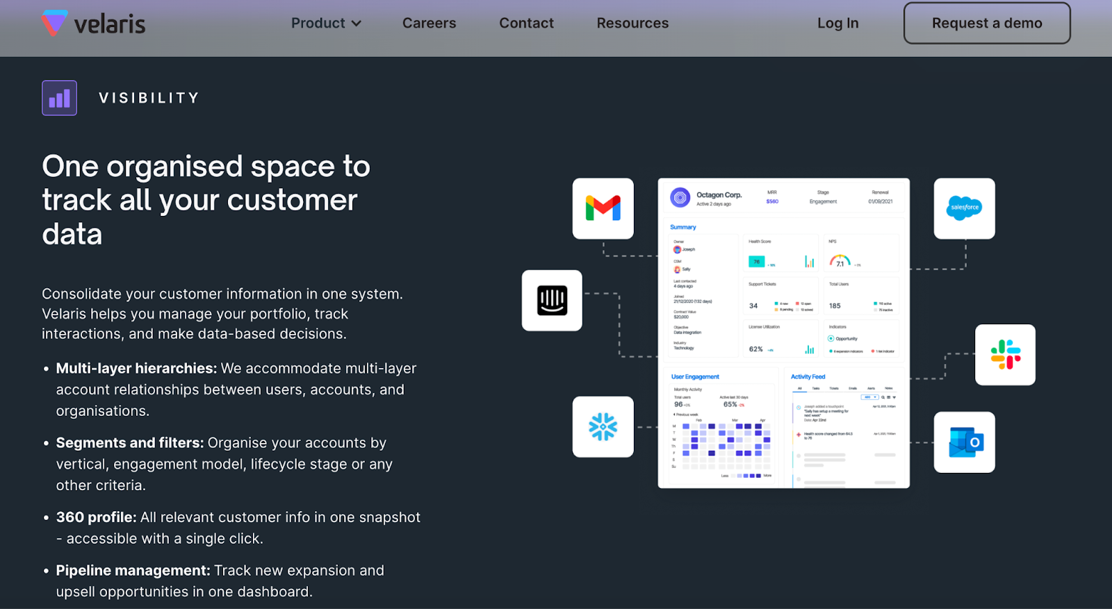
For example, a business can create hierarchies that separate accounts by regions, divisions, or specific customer segments while maintaining an overarching view of customer health, product usage, and performance metrics across all layers. This allows customer success teams to drill down into specific segments or accounts while viewing the entire portfolio at a high level, making prioritizing actions based on customer behavior and needseasier.
Key analytics and reporting features in Velaris:
- Comprehensive customer profiles: Velaris helps create detailed profiles for each customer, capturing interaction history, product usage, and engagement levels. This helps businesses understand individual customer needs and tailor their approach.
- Usage analytics: Tracks how customers use your products or services, identifying patterns and trends that can inform product development and marketing strategies.
- Customer health scores: Velaris assigns health scores to customers based on various factors such as usage frequency, engagement levels, and support interactions. These scores help identify at-risk customers who may need additional attention.
- Customizable dashboards and reports: Set up customizable dashboards to track key performance indicators (KPIs) and generate reports tailored to specific business needs.
Pricing
- Starter Plan: Starts at $50 per user per month (billed annually)
- Professional Plan: Starts at $100 per user per month (billed annually)
- Enterprise Plan: Custom pricing based on specific needs and scale
User Reviews
- One user mentioned, ” Velaris is a powerful platform: it has all sorts of useful features for a CS team to become more productive (automation) and effective (dashboards, reporting, NPS). It concentrates the data we have on our customers into one single platform. There is no need to check all our other apps to understand the health of our customers; Velaris does it for us. It has made our job as CSMs much less redundant and has allowed us to focus on the customers that really matter for the enterprise”. (Source)
- Reviewers noted that the platform’s reporting features provide valuable insights that help improve customer relationships and reduce churn. (Source)
Drawbacks
- One user noted “While it is very intuitive and easy to implement, it is true that we were firstly a bit overwhelmed when just seeing the product. There are many features to try and I don’t think we’ve seen them all, but we are happy to keep growing and using the platform to our best advantage :).” (Source)
3. Hotjar
Hotjar is a powerful tool for user experience (UX) analysis and conversion rate optimization (CRO). It provides insights into how users interact with your website through heatmaps, session recordings, surveys, and feedback polls.
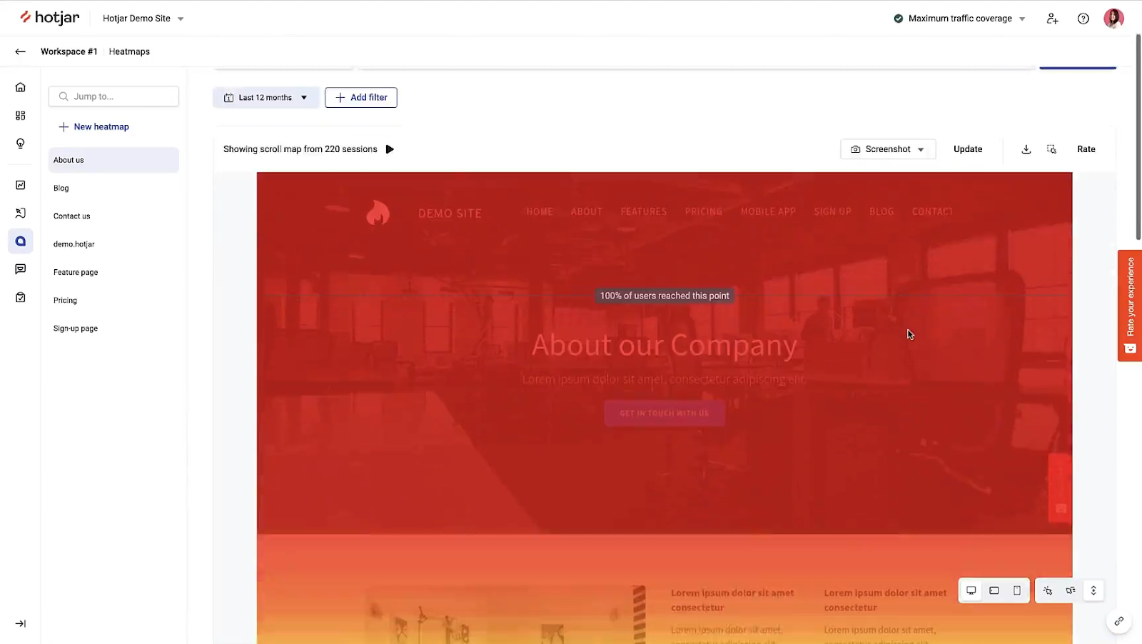
Hotjar is widely recognized for its visual and user-centric approach to analytics. Unlike traditional analytics tools, Hotjar emphasizes understanding user behavior through visual tools like heatmaps and session recordings. This makes it easier for businesses to pinpoint usability issues, understand intent, and optimize the user journey.
For example, an online retail store can use heatmaps to identify where users click the most and session recordings to observe how users interact with the checkout process.
Key analytics and reporting features in Hotjar:
- Heatmaps: Hotjar’s heatmaps visually represent where and how users click, scroll, and move their cursors. This helps businesses understand which elements are attracting attention and which are being ignored.
- Session recordings: Watch recorded sessions of users interacting with your website. Get a clear view of the user experience, revealing friction points and obstacles that might lead to drop-offs.
- Funnels: Hotjar’s funnel analysis tracks users’ steps before converting or dropping off. It identifies which pages or actions are causing users to leave, helping businesses optimize these stages to improve conversion rates.
- Surveys and feedback polls: Gather quantitative data directly from users through surveys and polls. These tools can be triggered at specific points in the user journey to capture immediate feedback on their experience.
Pricing:
- Free plan
- Plus plan: $39 per month (billed annually) or $50 per month (billed monthly)
- Business plan: Starts at $99 per month (billed annually) or $129 per month (billed monthly)
- Scale plan: Custom pricing (contact sales for a quote)
Useful reviews
- Users appreciate how these tools simplify the process of understanding user behavior. (Source)
- Users also highlight Hotjar’s strengths in providing actionable insights through heatmaps and feedback tools. (Source)
Some drawbacks
- Some users pointed out issues with the customer support response times and the limitations of the free version. (Source)
4. HubSpot Analytics
HubSpot Service Hub is a comprehensive customer service platform designed to help businesses deliver exceptional customer support, improve customer satisfaction, and build lasting relationships. The platform, in a nutshell, allows businesses to support their customers across various channels, including email, chat, and phone.
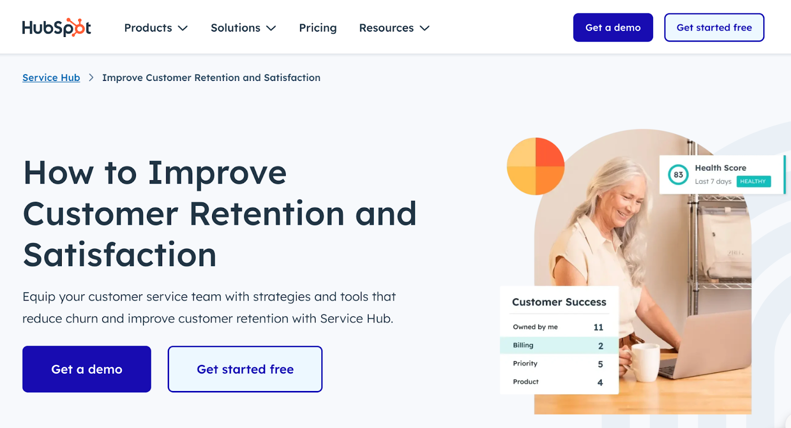
Service Hub has powerful tools to track, measure, and analyze customer service activities. It seamlessly integrates with the broader HubSpot ecosystem, including CRM, Marketing Hub, and Sales Hub. This provides a unified view of the customer journey and is a big reason for its popularity.
Key analytics and reporting features in Hubspot:
- Ticketing system: Track and manage customer issues and queries. Monitor ticket volume, response time, resolution time, and other key support metrics.
- Customer feedback tools: Collect customer feedback through surveys (e.g., NPS, CSAT). Analytics provide insights into customer satisfaction and help identify areas for improvement.
- Live chat and chatbot analytics: Track customer interactions that happen via live chat and chatbots. Get insights into speed of service, resolution efficiency, and other metrics.
- Call analytics: Analyzes call data, including call volume, duration, and outcomes, to improve phone support efficiency.
Pricing
- Starter Plan: $15 per month per seat.
- Professional Plan: $100 per month per seat.
- Enterprise Plan: $130 per month per seat.
Useful reviews
- One user said, “HubSpot Service Hub has transformed our sales operations. The intuitive ticketing system, comprehensive knowledge base, and powerful analytics have streamlined our processes and empowered my team to guide new sales leads to happy customers. The features for online chat have been amazing and we rely on this tool every day to connect with new leads.” (Source)
- User also say that it’s an “Excellent tool for team management and reporting” (Source)
Drawbacks
- While many find the platform user-friendly, some users have mentioned a learning curve associated with fully utilizing all the features, particularly for new users. They suggest that additional training resources or tutorials could enhance the onboarding experience. (Source)
5. UxCam
UXCam is a powerful mobile app analytics platform designed to help businesses understand and improve the user experience of their mobile applications. It offers a range of tools and features that provide deep insights into user behavior, interactions, and issues within the app.
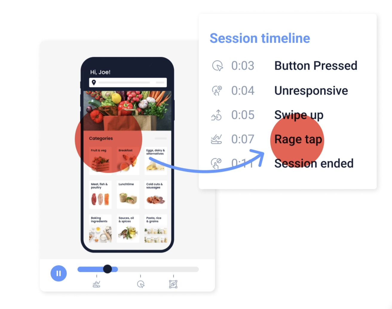
One popular feature of UXCam is its Session Replay functionality. This lets you capture and replay individual user sessions, providing a detailed view of how users interact with the app. By seeing exactly what users do, you can narrow down pain points, understand user behavior, and uncover usability issues that might not be evident through quantitative data alone.
Key analytics and reporting features in UXCam:
- Session recording: Records user sessions to provide a visual playback of user interactions within the app. This helps identify usability issues and understand user behavior in detail.
- Heatmaps: They are visual representations of user interactions, such as taps, swipes, and scrolls. They help identify popular and problematic areas in the app interface.
- User journey analysis: Maps out users’ paths through the app, highlighting common navigation patterns and drop-off points. It helps understand how users flow through the app and where they encounter obstacles.
- Crash analytics: Provides detailed reports on app crashes, including the steps leading up to the crash and user interactions at the time.
- Funnel analysis: Tracks user progression through key workflows or conversion paths in the app, helping identify where users drop off and optimizing the conversion process.
- Event analytics: Tracks custom events defined by the business, such as button clicks, form submissions, and other critical interactions.
Useful user reviews:
- Users Mixpanel as a “crucial data analytics tool” for SaaS success, emphasizing its detailed tracking capabilities. (Source)
- One user stated, “Mixpanel is the key to your insights,” emphasizing its role in data-driven decision-making. (Source)
Some drawbacks
- However, they also mention cons, such as user profiling challenges and in-depth analysis complexity. (source)
- Some users have mentioned that the pricing can be a barrier for smaller businesses, and some have experienced issues with customer service. (Source)
Pricing:
- Free Plan
- Growth Plan: Custom Pricing
- Enterprise Plan: Custom pricing
6. Amplitude
Amplitude is a popular product analytics platform designed to help businesses understand user behavior and optimize their digital products. Known for the depth of data insights and ease of use, Amplitude is widely used by product teams, marketers, and data analysts to drive growth and enhance user experiences.
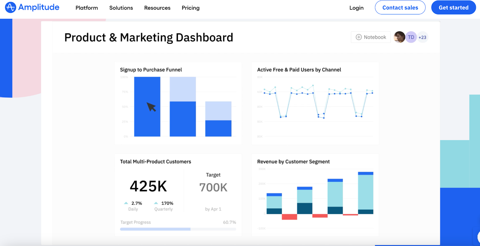
Amplitude excels at creating dynamic groups based on user behavior. This helps businesses track how specific user groups interact with their products over time and find patterns and trends.
For example, imagine a business that has a mobile app. Using Amplitude, this business can group users who check the app daily into one category and users who use the app once a week into another. Over time, the business can observe these groups to see which features daily users interact with the most and which ones weekly users ignore. This helps the company understand habits and preferences better, allowing them to make improvements for different users who use their app.
Key analytics and reporting features in Amplitude:
- Event tracking: Amplitude tracks events, such as clicks, page views, and in-app actions, to provide a detailed view of how users interact with a product.
- Funnels and path analysis: Visually analyze user journeys through funnels to understand drop-off points and optimize conversion paths.
- Retention analysis: This feature tracks how well businesses retain users over time, identifying patterns contributing to user retention or churn.
- Dashboards: Customizable dashboards that aggregate crucial metrics and KPIs, providing a comprehensive view of product performance.
- Cohort analysis: Create and analyze cohorts to track user behavior over time and assess the impact of product changes or marketing efforts.
- Custom reports: Generate detailed reports based on specific queries or criteria, offering flexibility to focus on particular aspects of user behavior or product performance.
Useful user reviews:
- Amplitude offers detailed event tracking and user behavior analysis. One user mentions that Amplitude is invaluable for refining user experience, especially when tracking user drop-off points in funnels. (source)
- Users highlight Amplitude’s strong data export functionality, robust A/B testing capabilities, and excellent training resources. They also praise its event-driven analytics approach, allowing for detailed tracking of user interactions. (source)
Some drawbacks:
- There are mentions of the complexity involved in setting up and using the platform effectively. (Source)
Pricing:
- Free plan
- Growth plan: Starts at $995/month (billed annually).
- Enterprise plan: Custom pricing based on specific business needs.
7. InMoment
InMoment is a customer experience (CX) and feedback management platform designed to help businesses understand and improve their customer interactions. It integrates various feedback forms, including surveys, social media, and other customer touchpoints, to provide a comprehensive view of customer sentiment.
The platform uses AI and machine learning to provide deep insights into customer behavior, trends, and sentiment. This helps businesses understand the “why” behind customer feedback.
Key analytics and reporting features in InMoment:
- Sentiment Analysis: InMoment’s AI-driven tools analyze customer feedback to determine the sentiment behind opinions and identify key drivers of satisfaction or dissatisfaction.
- Text Analytics: The platform processes open-ended feedback to extract themes, trends, and actionable insights from customer comments.
- Journey Mapping: Track and analyze customer journeys across different touchpoints to understand how interactions influence overall satisfaction.
- Benchmarking: InMoment provides tools for benchmarking performance against industry standards or competitors, helping businesses gauge the effectiveness of their customer experience strategy.
Useful reviews:
- They highlight the software’s intuitive dashboards, reliable platform, and consistent support from account managers. (Source)
- Users highlight InMoment’s key features, including real-time feedback, text analytics, sentiment analysis, voice of the customer, and survey management. They also mention the software’s customer journey mapping, dashboards, and reporting capabilities. (Source)
Some drawbacks
- Some users mention a steep learning curve, especially for text analytics, and a lack of flexibility in integrating with other tools. (source)
Pricing:
- InMoment’s pricing typically starts in the range of $100 to $500 per month
- InMoment offers custom pricing tailored to specific requirements.
8. Pendo
Pendo is a product analytics and user feedback platform designed to help businesses understand how users interact with their products. It provides tools for product managers, marketers, and customer success teams to gain insights into user behavior, track feature adoption, and enhance the overall user experience.
Pendo is famous for its comprehensive tool suite that combines product analytics with user feedback and in-app guidance.
Key analytics and reporting features in Pendo:
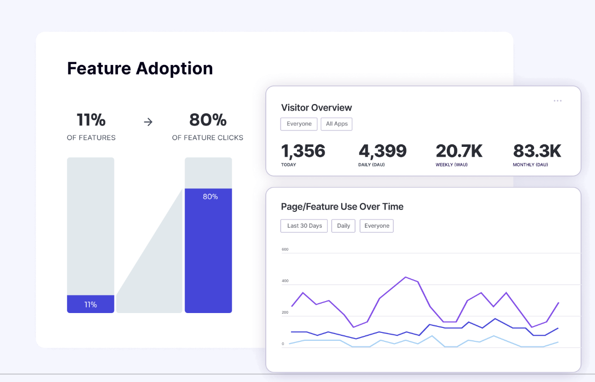
- Feature Analytics: Pendo tracks how users interact with specific features, providing insights into feature adoption, usage patterns, and drop-off points.
- User Segmentation: Categorize users based on attributes like usage frequency, volume of interactions, and demographics.
- Journey Mapping: Map user journeys and visualize how users navigate the product, identifying key touchpoints and friction areas.
- Custom Dashboards: Get customizable dashboards to display key metrics and trends, enabling teams to monitor product performance and user engagement.
- Retention Reports: Detailed reports on user retention help businesses understand how well they retain users over time and identify factors contributing to churn.
Useful Reviews:
- Pendo’s analytics provides insights into user behavior, feature usage, and engagement metrics. They appreciate the ease of use and the ability to quickly gain insights into product usage. (Source)
Drawbacks:
- Some users note that Pendo may focus more on creating visually impressive graphs rather than providing data directly tied to product marketing goals. (Source)
- Some mention the complexity of customization and the potential for Pendo’s pricing to become expensive as monthly active users (MAUs) increase. (Source)
Pricing:
- Free plan
- Starter Plan: Starts at $7,000 per year (or $2,000 per quarter)
- Growth Plan: Custom pricing
- Portfolio Plan: Custom pricing
9. Clevertap
Clevertap is a leading customer engagement and retention platform that combines analytics, segmentation, and personalized communication to help businesses understand their customers and engage with them more effectively. It is widely used by product managers and customer experience professionals.
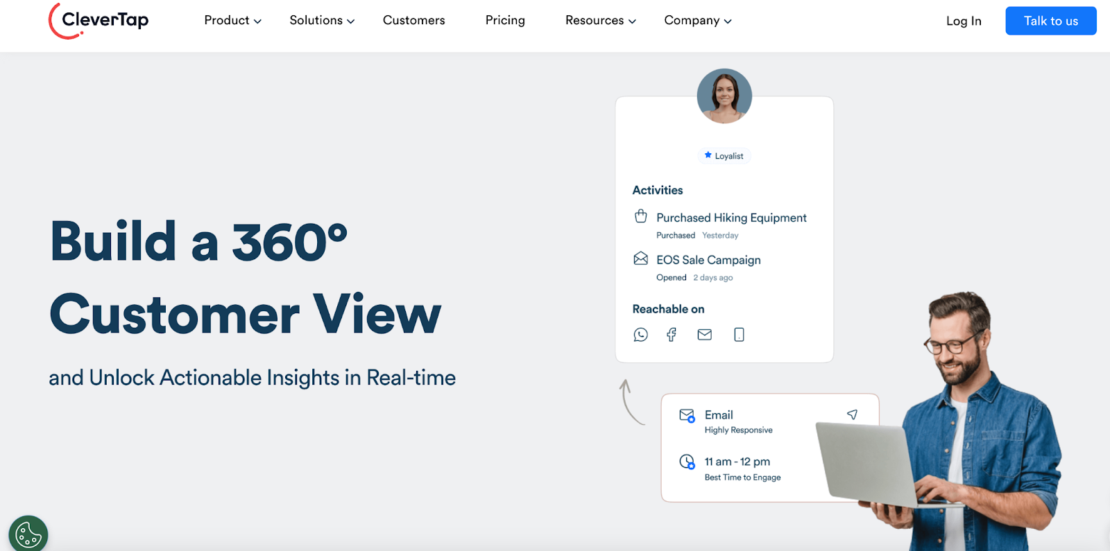
Clevertap is famous for its real-time customer engagement capabilities, which allow businesses to deliver personalized experiences across multiple channels, including mobile apps, websites, and email.
Customer Analytics and Reporting Features
- Behavioral analytics: Track user interactions across various touchpoints, providing insights into behavior, preferences, and trends. This helps businesses understand how users interact with their products and where they encounter friction.
- User segmentation: The platform enables advanced segmentation of users based on a wide range of attributes, including demographics, behavior, and engagement levels. This allows businesses to tailor their messaging and offers to specific user groups.
- Retention and cohort analysis: Clevertap’s retention analysis helps businesses understand how well they retain users over time, while cohort analysis allows them to track the behavior and engagement of specific user groups.
- A/B testing reports: Clevertap’s A/B testing capabilities are integrated with its reporting tools, enabling businesses to compare strategies and determine which one performs best.
Useful Reviews
- Reviews on G2 emphasize CleverTap’s strengths in user tracking, campaign management, and notifications. Users find the platform helpful in understanding user behavior patterns and creating targeted campaigns. (Source)
- Users on Capterra praise CleverTap for its real-time analytics, powerful segmentation engine, and ability to run personalized campaigns. (Source)
Drawbacks
- However, some users mention that CleverTap is more focused on mobile apps than websites and the pricing can be higher as the scale of events grows. (Source)
10. Tableau
Tableau by Salesforce is a leading data visualization and business intelligence (BI) platform that helps organizations transform raw data into actionable insights through interactive and shareable dashboards. It is widely used across industries for its powerful analytics capabilities and user-friendly interface, enabling businesses to make data-driven decisions more efficiently.
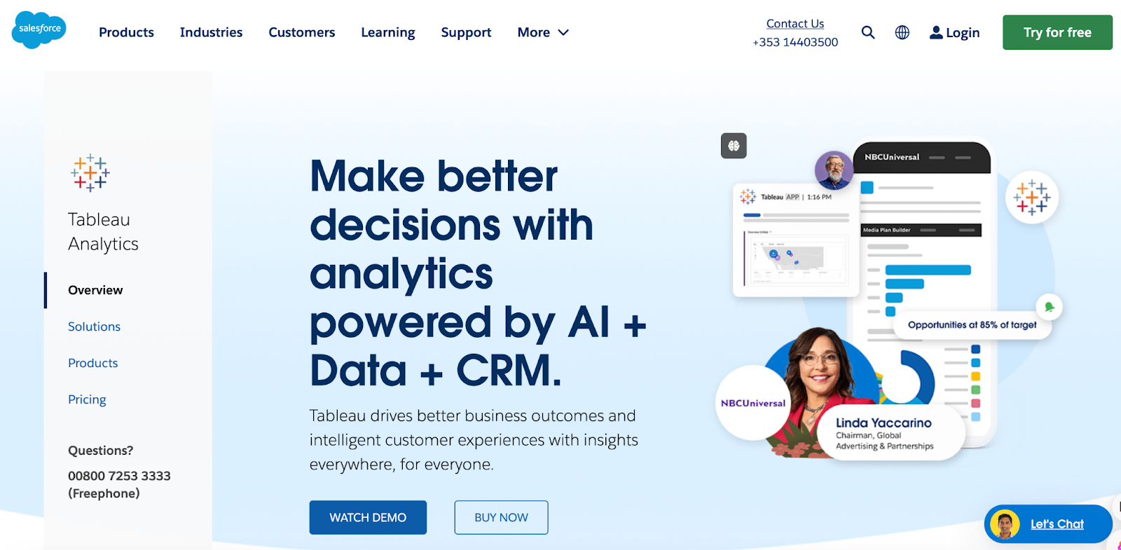
A unique aspect of Tableau is its ability to handle large and complex datasets, offering real-time insights through highly interactive and visually appealing dashboards.
Key analytics and reporting features in Tableau:
- Interactive dashboards: Tableau’s dashboards are highly interactive, allowing users to drill down into specific data points, filter views, and explore data from different angles. These dashboards can be shared across the organization for collaborative decision-making.
- Data integration: Tableau can connect to multiple data sources, including CRM systems, web analytics, social media platforms, and databases. This allows businesses to consolidate customer data from different touchpoints into a single view.
- Customer satisfaction and NPS reports: Tableau can visualize customer feedback and Net Promoter Score (NPS) data, offering a clear view of customer satisfaction and loyalty.
- Churn analysis: Businesses can use Tableau to identify factors leading to customer churn, analyze at-risk segments, and implement strategies to reduce churn rates.
- Sales performance reports: These reports provide insights into sales trends, conversion rates, and customer acquisition costs, helping businesses understand the effectiveness of their sales strategies.
Useful reviews
- Users appreciate that Tableau allows for more customization and flexibility in creating dashboards. (Source)
- Users commend its ability to handle large datasets and create insightful dashboards. (Source)
Some drawbacks
- A user mentioned, “Once you get used to Tableau’s interface, it becomes much easier to create complex visualizations, but it can be daunting at first”. (Source)
Pricing
- Tableau Viewer: $15 per user per month (billed annually).
- Tableau Explorer: $42 per user per month (billed annually).
- Tableau Creator: $70 per user per month (billed annually).
11. Keap
Keap (formerly known as Infusionsoft) is an all-in-one CRM, sales, and marketing automation platform designed for small businesses.
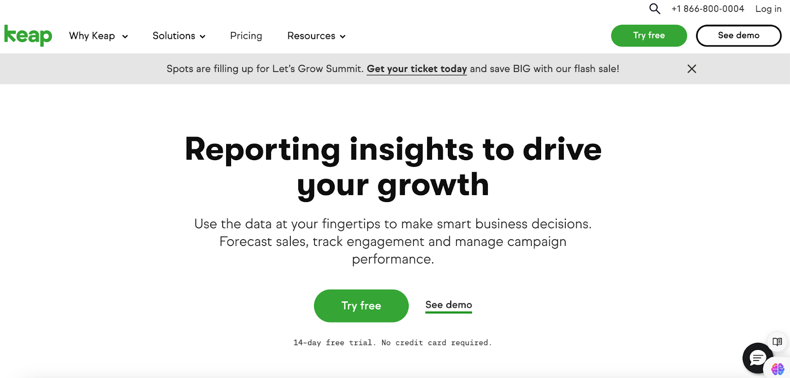
Keap integrates lead management, customer communication, payment processing, and other key functionalities, making it a valuable tool for businesses aiming to improve customer retention and streamline operations.
Key analytics and reporting features in Keap:
- Contact management: Keap allows businesses to segment customers based on behavior, purchase history, or interaction with marketing materials. This segmentation is useful for targeted marketing campaigns and personalized customer outreach.
- Sales pipeline analytics: Keap’s sales pipeline feature provides insights into how leads move through the sales funnel, helping businesses identify bottlenecks and opportunities for improving conversions.
- Campaign performance: Analyze marketing campaigns’ performance in terms of open rates, click-through rates, and conversion rates.
Useful reviews
- Users rate Keap positively for its automation capabilities and user-friendly interface. They appreciate the CRM’s ability to manage leads and customer interactions effectively. (Source)
Drawbacks
- Some reviews mention that the analytics functionality is limited, particularly for sales forecasting and detailed performance insights. (Source)
12. Mixpanel
Mixpanel is a powerful product analytics platform that helps businesses understand how users interact with their products. The platform stands out for its event-based tracking. Unlike traditional analytics, which focuses on tracking page views, Mixpanel tracks specific user actions (events) within a product.
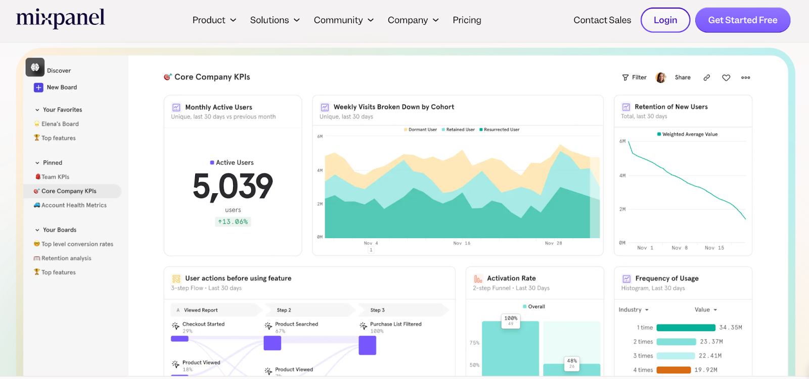
This detailed approach gives product managers and growth teams a more thorough understanding of user behavior.
Key analytics and reporting features in Mixpanel:
- Real-time data analysis: Mixpanel offers real-time tracking and reporting to help you gain insights into user behavior and make timely decisions.
- Cohort analysis: This feature allows businesses to group users based on specific characteristics or behaviors and analyze their actions over time. Cohort analysis helps identify trends and patterns among different user segments.
- Funnel analysis: Mixpanel’s funnel analysis helps businesses understand how users move through various stages of their product or service. This is crucial for identifying drop-off points and optimizing conversion rates.
- Retention reports show how often users return to your product or service after their initial visit, helping businesses understand user engagement and loyalty.
- Segmentation: Bucket users based on various attributes such as demographics, behavior, or acquisition source. This enables more targeted analysis and personalized marketing strategies.
- A/B Testing: Run A/B tests to compare different versions of a product feature or marketing campaign. This helps determine which variation drives more engagement.
- Customizable dashboards: Users can create personalized dashboards to track the metrics and KPIs that matter most to their business. This ensures that the most relevant data is always easily accessible.
User reviews
- Users note Mixpanel’s strengths in providing actionable insights through event tracking and user engagement analytics. Users commend its real-time data processing and the ability to create custom reports. (Source)
- Users appreciate Mixpanel for its powerful analytics features and the ability to track user journeys effectively. They find it particularly useful for product teams looking to understand user behavior and improve retention. (Source)
Drawbacks
- Some feedback indicates that the interface can be complex for new users, and the support options could be improved. (Source)
Pricing:
- Free plan
- Growth plan: Starts at $25/month
- Enterprise plan: Custom pricing based on specific business needs.
Things to keep in mind while selecting a customer analytics software tool
When selecting a customer analytics software tool, there are several key factors to consider:
Goals and Objectives
Start by clearly defining your goals and objectives for implementing a customer analytics tool. What specific insights are you looking to gain? Some common goals include:
- Understanding customer behavior and preferences
- Identifying high-value customer segments
- Optimizing marketing campaigns and ROI
- Improving customer experiences and reducing churn
- Making data-driven business decisions
Data Collection and Integration
Look for a tool that can seamlessly gather customer data from various touch points like your website, app, CRM system, and marketing channels. The ability to integrate data from multiple sources is crucial for gaining a comprehensive view of the customer journey
Reporting and Dashboards
Different teams have unique data needs, so customizable dashboards and reporting features are crucial. The tool should empower each team to build their own visualizations and reports, democratizing data access and facilitating data-driven decision-making across the organization.
Key Metrics
Some important customer analytics metrics to track include:
- Customer acquisition cost (CAC)
- Customer lifetime value (CLV)
- Churn rate
- Customer satisfaction score (CSAT)
- Net promoter score (NPS)
- Customer engagement metrics (e.g., website visits, app usage, email opens)
Ease of Use
Consider the customer analytics software’s ease of use and learning curve. The platform should have an intuitive interface and documentation to enable quick adoption. Some vendors also offer training and support to help your team get up to speed faster.
Ready to leverage customer insights to improve decision-making?
The ability to interpret customer data effectively is critical to staying on top of customer expectations. Choosing the right analytics tool can unlock insights that lead to better decision-making and stronger customer relationships.
Among the top tools, Amplitude stands out for its deep behavioral analytics. Tableau excels in its powerful data visualization capabilities, and Hotjar offers quality insights into user behavior through heatmaps and session recordings. Keap integrates CRM with automation, making it ideal for small businesses, while Pendo shines in product experience insights.
Now, if you’re looking for a solution that combines ease of use with powerful analytics, helping you pinpoint bottlenecks and derive insights that you can act upon, check out Hiver.
Take this interactive tour to see Hiver in action.