Hiver is on a journey to solve the fundamental problems with business email that lead to email clutter and overload, without taking anything away from its simplicity and speed. Hiver is everything you’ve always wanted email to be.
We’ve gone back to the drawing board and redesigned Hiver from the ground up to make email work better for you — to help you become more productive and collaborate better with your team. Our new user interface has been designed keeping in mind the core pillars of usability and scalability.
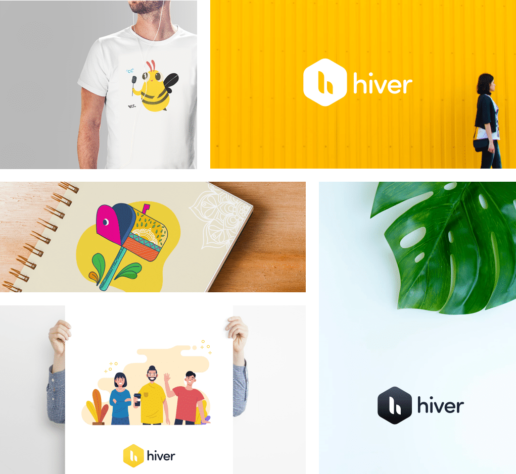
The whole is greater than the sum of its parts: whether you call it collaboration, teamwork, synergy, or something else, there is something special that happens when we work together. Our new, minimal logo embodies this philosophy.
Acacia Honey energizes and radiates positivity. Shades of Forget me not and Ocean Blue are easy on the eyes and have a calming effect. Our renewed color palette brings in the perfect balance to help you achieve optimum productivity.
Hear our thoughts on the rebrand, our new user interface and our renewed promise to make Hiver everything you’ve always wanted email to be.
Read the blog